Ivory, Champagne, or Blush: Fall Wedding Colors for Brides
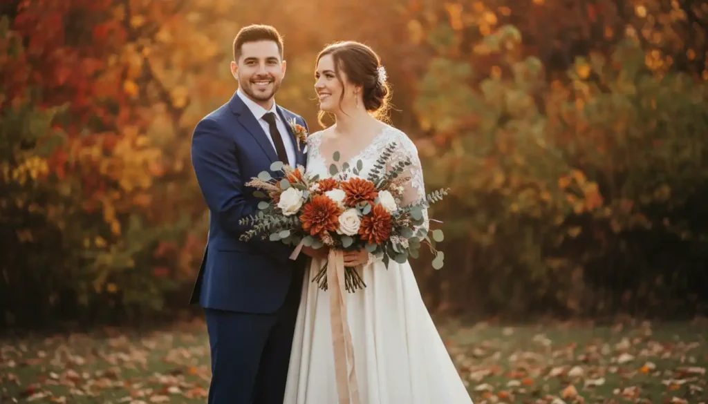
Picking fall wedding colors can feel harder than picking your venue. Between ivory, champagne, blush, terracotta, and jewel tones, it is easy to second guess every swatch you touch. You want a palette that photographs well against changing leaves, works for every bridesmaid’s skin tone, and still feels like you. This guide breaks down real fall wedding colors, from classic bridal shades to bold combinations like terracotta and blue, so you stop guessing and start planning with confidence. No fluff, just colors that actually work for your big day.
Why Fall Wedding Colors Feel Different This Season?
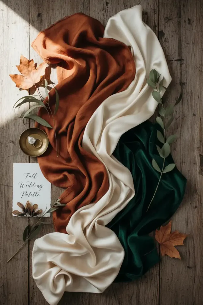
Fall wedding colors carry more warmth and depth than spring or summer palettes, and that shift can feel overwhelming when you are staring at fifty swatches with no plan. You want a palette that photographs well against changing leaves and warm venue lighting, not one that competes with it. Start with your dress shade first, then build outward.
Pick two anchor colors and one accent, and test them under both daylight and string lights before ordering anything. A palette built this way holds up in photos taken at noon and at your reception, giving you one less thing to second guess.
Ivory, Champagne, or Blush: How to Pick Your Perfect Base
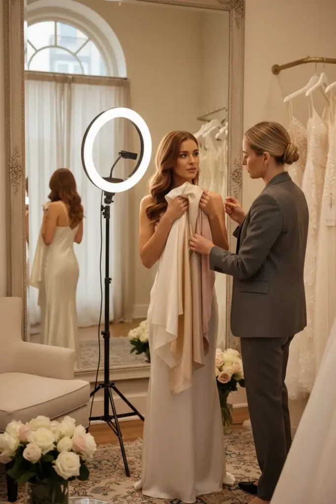
Standing in a boutique with three “white” dresses that look nearly identical is a real problem, and most brides cannot tell the difference until the fabric sits against their skin. Ivory reads warm and forgiving, champagne leans golden and rich, and blush adds a soft pink undertone.
Hold each swatch under natural light near your face, not the boutique’s overhead lighting, which flattens undertones. If your skin leans warm, champagne will look luminous instead of washed out. Book your fitting near a window and bring a photo of your venue lighting to compare on the spot.
This ivory wedding dress is perfect for a dreamy wedding!
Fall Wedding Color Schemes for Bridesmaid Dresses That Actually Work
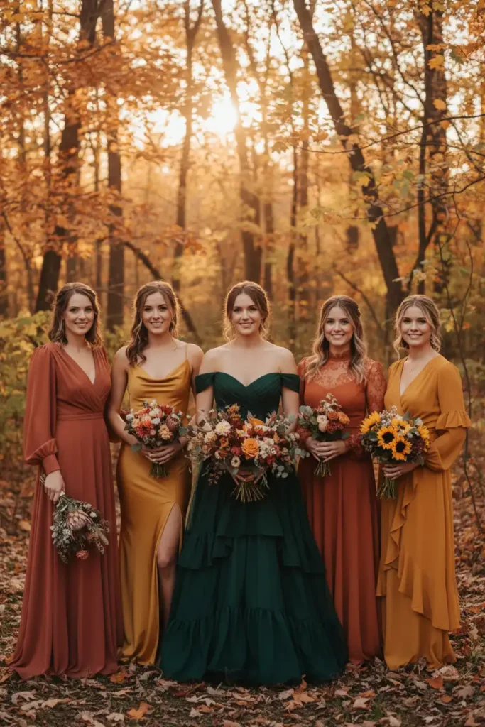
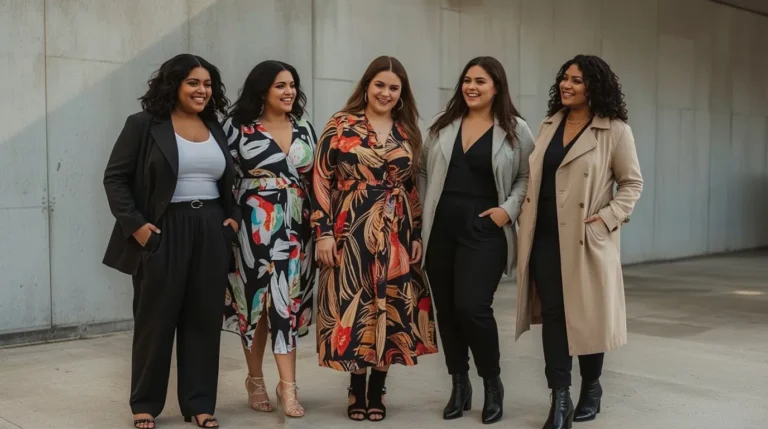
Getting five bridesmaids to agree on one dress color is nearly impossible, and forcing identical dresses on different body types rarely looks good in photos. Fall wedding color schemes for bridesmaid dresses work best when you pick one color family and let each dress style vary.
Choose a mid tone like terracotta or deep olive as your anchor, then allow lighter and darker shades within that family for different skin tones. Mixed necklines and lengths in matching fabric keep the look cohesive without matching perfectly. Send your bridesmaids three approved shades and let each pick the silhouette that fits her best.
This plus-size wedding dress is a perfect addition!
Nothing beats the feel of this elegant evening gown!
Bridesmaid Dresses in Unique Fall Shades Your Girls Will Love
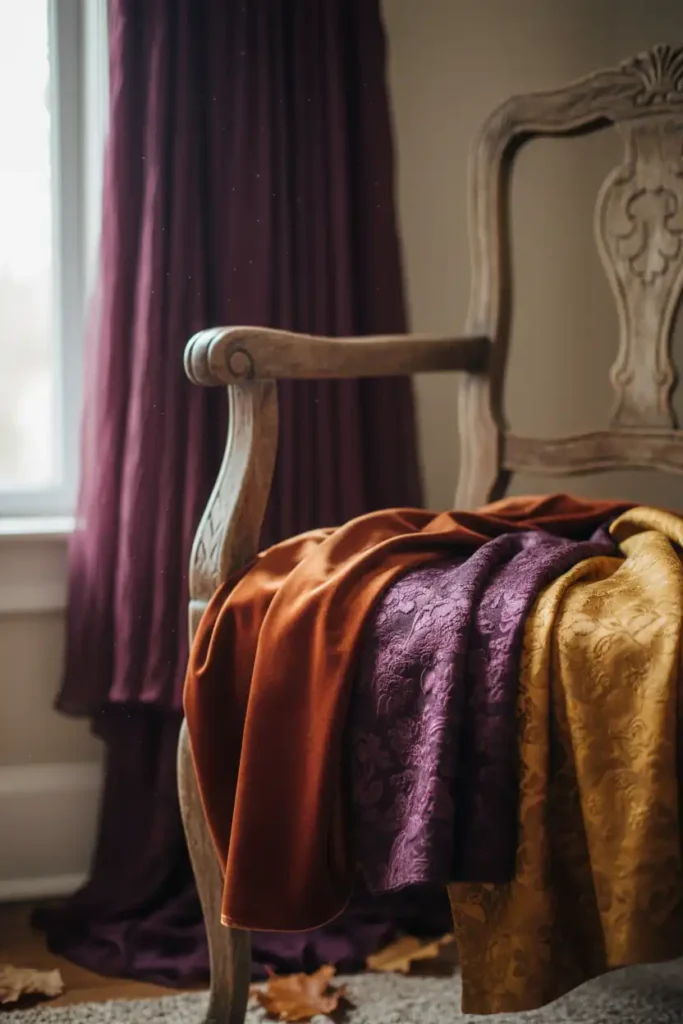
Sticking to burgundy or navy for every fall wedding gets predictable fast, and your bridesmaids notice when a color feels like an afterthought. Bridesmaid dresses in unique fall shades give your bridal party personality without straying from the season. Consider plum, burnt sienna, or deep mustard instead of the usual suspects.
These shades photograph beautifully against orange and red foliage and still read formal in a reception hall. Order fabric swatches before committing, since screen colors rarely match what arrives in person.
Elegant and chic, this dress is perfect for any special occasion!
Elegant and perfect for any event. This maxi dress is a must-have!
How to Choose a Bride’s Dress That Complements a Rustic Venue
A structured ball gown can look out of place against exposed wood beams and string lights, and that mismatch is a common regret brides mention after the wedding. Knowing how to choose a bride’s dress that complements a rustic venue starts with fabric, not just silhouette.
Soft, flowing fabrics like chiffon or crepe move naturally in outdoor and barn settings, while heavy structured satin can feel formal to the point of stiff. Lace details pick up texture from wood and greenery instead of fighting it. Visit your venue before your final fitting so you can picture the dress against the actual backdrop.
Colors That Compliment Bronze for a Warm Autumn Glow
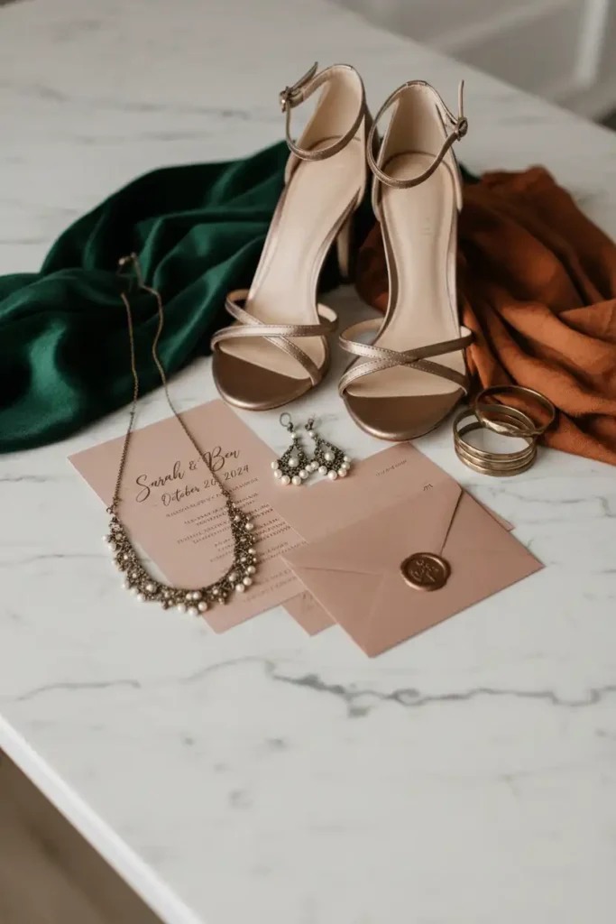
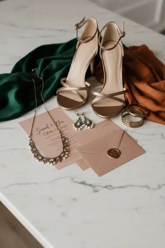
Bronze accents look stunning in theory, but pairing them with the wrong palette can turn your whole look brassy instead of warm. Colors that compliment bronze lean toward deep, saturated tones rather than pastels, which tend to wash the metallic out.
Forest green, rust, and deep burgundy all pull warmth from bronze instead of clashing with it. Use bronze in smaller doses, jewelry, shoe buckles, or table details, so it accents your palette instead of overwhelming it. Pair one bronze element with your bouquet ribbon to test the combination before finalizing decor.
Perfect gown for your big day! This dress compliments your big day’s color scheme!
Building an Autumn Color Scheme Around Your Skin Tone
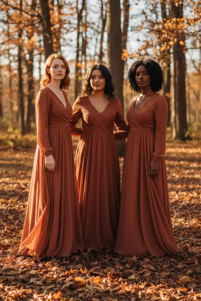
The same terracotta dress can look completely different on two people, and that is where a lot of bridal party color planning goes wrong. An autumn color scheme should account for skin undertone, not just personal preference.
Warm undertones glow next to rust, mustard, and olive, while cooler undertones often look best in plum, wine, or deep teal. If your bridal party has a mix of undertones, choose one warm and one cool shade from the same color family so everyone has an option. Ask each bridesmaid to hold a fabric swatch near her face in daylight before placing the order.
This terracotta dress is perfect for formal events! Elegant and comfortable!
Absolutely stunning for any special occasion!
Indian Wedding Color Palettes for a Fall Celebration
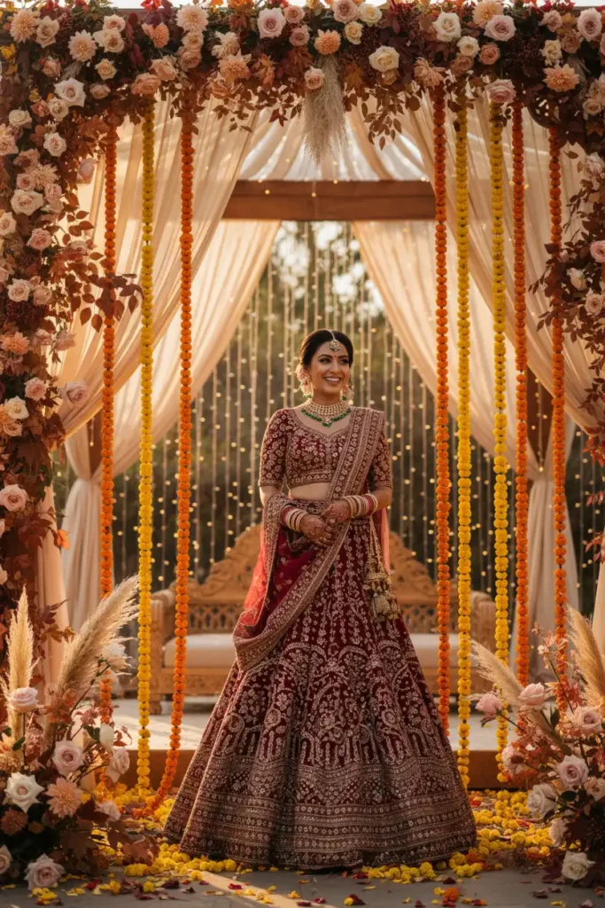
Blending traditional Indian wedding colors with a fall setting takes some thought, since classic reds and golds already carry deep meaning you do not want to lose. Indian wedding color palettes for a fall celebration can still honor tradition while picking up seasonal warmth.
Add marigold, deep maroon, or bronze into your florals and decor alongside traditional red and gold fabric. Layering in rust colored drapery softens the formality without replacing tradition. Work with your decorator to add one seasonal accent color into an otherwise classic palette so both elements feel intentional.
This bridal lehenga will make you feel like a princess on your special day!
Wedding Color Palettes That Photograph Well in Every Season
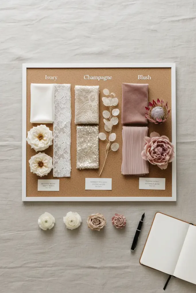
A palette that looks great on Pinterest does not always photograph well in real lighting, and that gap causes real disappointment on wedding day. Wedding color palettes need to be tested against your actual venue lighting, not just a moodboard.
Photograph your fabric swatches in the same lighting conditions as your ceremony and reception before finalizing anything. Colors that look rich indoors can appear muddy outdoors at golden hour. Build a small physical swatch board and take it outside at the time your ceremony will happen to see how it actually reads.
What’s Trending for Fall 2027 Weddings
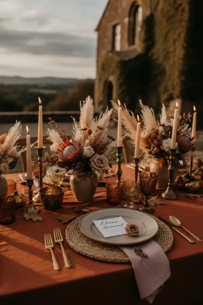
Wedding color trends shift every year, and what looked fresh two seasons ago can feel dated in your photos. Fall 2027 is moving away from strictly rustic orange and brown toward richer, moodier combinations. Expect to see terracotta paired with navy or blue, deep plum with sage, and warm neutrals layered with black accents.
These combinations still feel like fall but read more sophisticated than the classic pumpkin spice palette. If you want your wedding to feel current, lean into one unexpected color pairing rather than the most obvious seasonal choice.
Forest Green: The Rich Shade Every Bride Should Consider
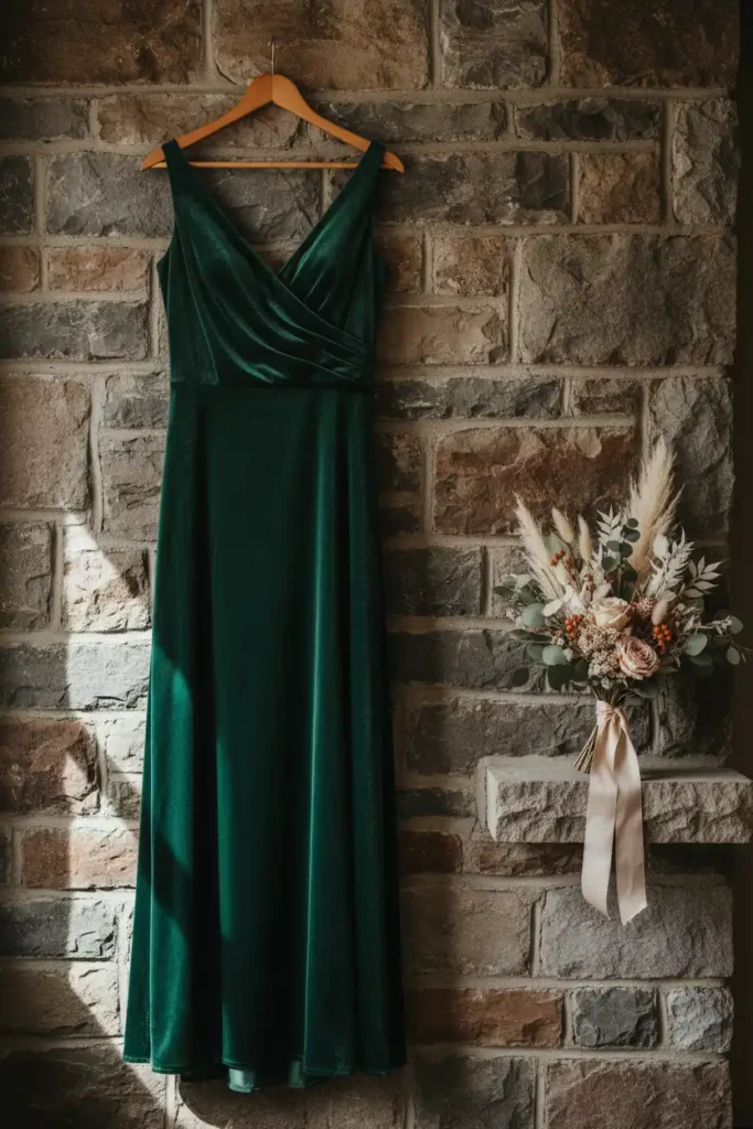
Forest green gets overlooked because brides assume it only works for Christmas weddings, but that assumption limits a genuinely versatile color. Forest green pairs naturally with fall foliage and holds up beautifully in both daylight and candlelight.
Use it as a bridesmaid dress color, groomsmen accent, or table linen base, and it reads elegant without trying too hard. Pair it with cream or rust for contrast that still feels warm. If you are unsure about committing to green for the whole bridal party, start with it in the florals and groomsmen ties before deciding on dresses.
This forest green wedding dress is what you’re looking for!
Navy and Terracotta: A Color Combo for Fall Romance
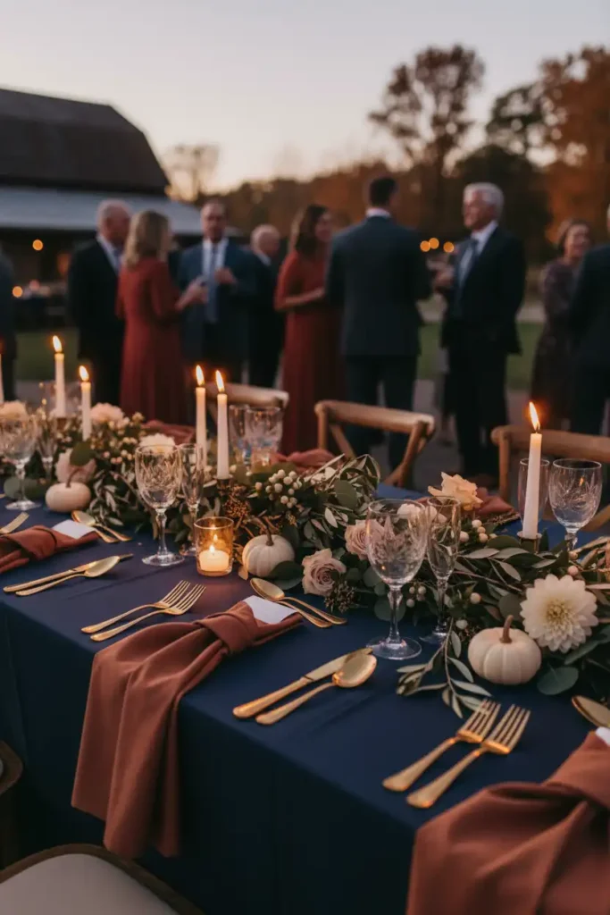
Navy alone can feel too formal for a fall wedding, and terracotta alone can feel too casual, but together they solve both problems. A navy terracotta color pairing balances warmth and structure in a way few other combinations manage. Use navy for suits, linens, or bridesmaid dresses, and terracotta for florals, ribbon, and smaller accents.
The contrast photographs beautifully against both indoor and outdoor fall backdrops. Test the pairing in your invitation suite first, since it is the easiest place to preview the combination before committing to larger decor purchases.
Why Rust and Blue Make Such a Striking Pairing
Rust and blue sit on opposite ends of the color wheel, and that contrast is exactly why the combination works so well for a fall wedding. Rust and blue keep a palette from feeling flat or one note. Use rust in your bouquet and florals, and let blue carry through in suits or bridesmaid sashes.
The two colors do not compete because they pull from different temperature families, one warm and one cool. If you want a bolder look, deepen the blue to navy and let rust stay saturated rather than muted for the strongest visual contrast.
Your groom’s deep blue suit is right here!
Vivid Tones for Brides Who Don’t Want to Blend In
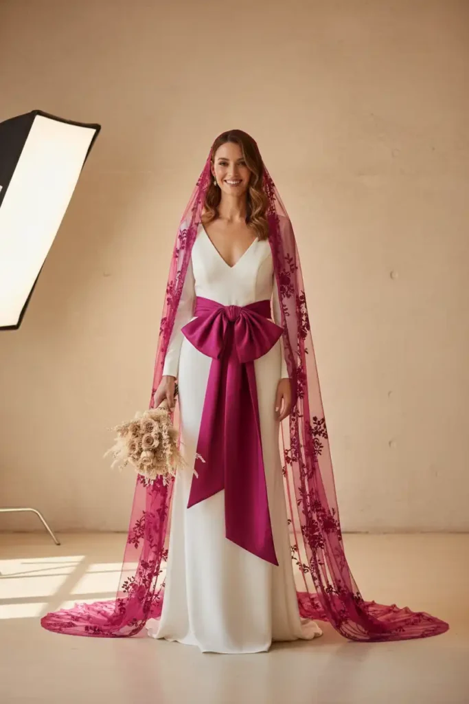
Not every bride wants a muted, traditional fall palette, and that preference is completely valid even though it is less common in wedding inspiration boards. Vivid tones can still feel intentional and elegant instead of chaotic.
Choose one saturated color, deep magenta, bold orange, or rich cobalt, and keep the rest of your palette neutral so the vivid shade has room to stand out. Use it in your bouquet ribbon, bridesmaid sashes, or a colored veil for a subtle statement. Commit to just one vivid accent color rather than several, so your photos read as styled instead of mismatched.
Terracotta and Burgundy for a Moody Autumn Palette
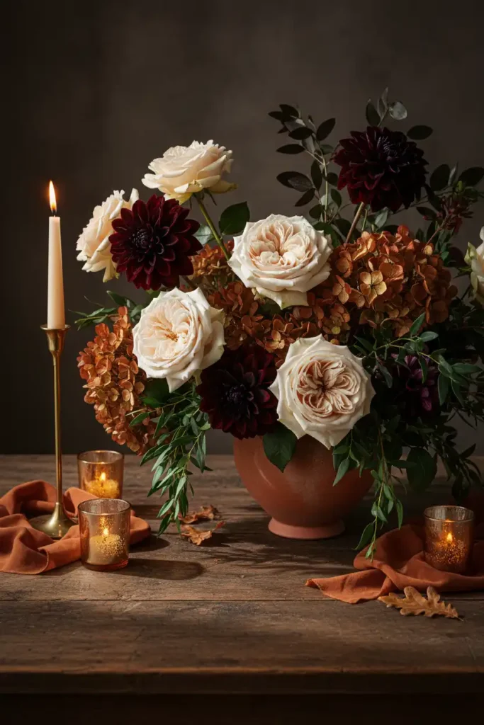
Some brides want their fall wedding to feel dramatic rather than soft, and that mood is harder to achieve than it looks without the right color combination. Terracotta and burgundy together create depth without going fully dark. Use terracotta as your lighter, warmer base and burgundy for depth in florals, linens, or bridesmaid dresses. Keep lighting warm and low to let the colors read rich instead of muddy in photos. Add one metallic accent, brass or gold, to keep the palette from feeling too heavy in daylight shots.
These flowers are perfect for a beautiful wedding centerpiece!
Planning Your Dream Wedding Around a Signature Color
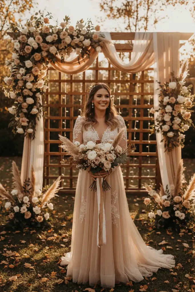
Trying to include every color you love ends up looking scattered instead of cohesive, and that is one of the most common styling mistakes brides make. A dream wedding usually centers on one signature color that repeats throughout the day.
Pick a single shade you want guests to remember, then build your neutrals and accents around it. Repeat that color in your bouquet, one bridesmaid detail, and your reception lighting so it feels intentional rather than random. Resist the urge to add a second bold color unless it is purely for contrast in small doses.
Emerald Green Details That Feel Luxe Not Loud
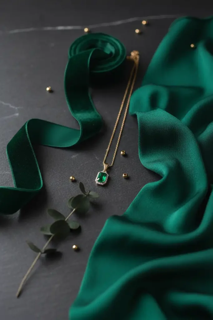
Emerald green can look costume like if it is overused, and that is the biggest hesitation brides have before choosing it. Used in the right places, emerald green reads luxurious instead of loud. Keep emerald to one or two elements, a velvet ribbon, bridesmaid sash, or groom’s tie, rather than dressing the whole bridal party in it. Pair it with warm neutrals like champagne or rust so it does not read cold. Try emerald in your invitation suite or table runners first if you are nervous about committing to it in dresses.
Terracotta and Blue Wedding Palette Ideas for Outdoor Ceremonies
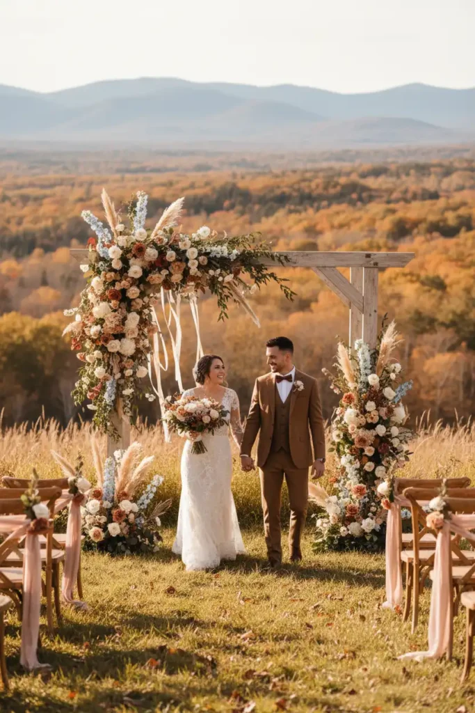
Outdoor ceremonies need colors that hold up against natural backdrops, and a terracotta and blue wedding palette does exactly that without competing with the landscape. This combination works especially well for ceremonies set against open sky or fields. Use terracotta in your florals and ceremony arch, and let dusty blue carry through in bridesmaid dresses or table linens.
The pairing photographs well from morning through golden hour without shifting tone. Bring fabric swatches outside at the time of day your ceremony will happen to confirm the colors hold up in that light.
Mixing Metallics with Your Fall Palette Without Overdoing It
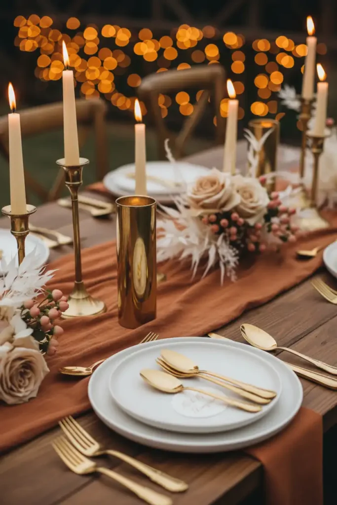
Too much metallic in fall decor can start to look like a costume party instead of a wedding, and that is a mistake worth avoiding early in planning. One metallic tone mixed sparingly adds warmth without overwhelming your palette. Choose brass or gold over silver for a fall wedding, since warmer metals photograph better against orange and rust tones.
Use metallics in small details, candle holders, flatware, or frame accents, rather than large decor pieces. Stick to one metallic finish throughout your decor so nothing looks mismatched in photos.
Common Color Mistakes Brides Make and How to Fix Them
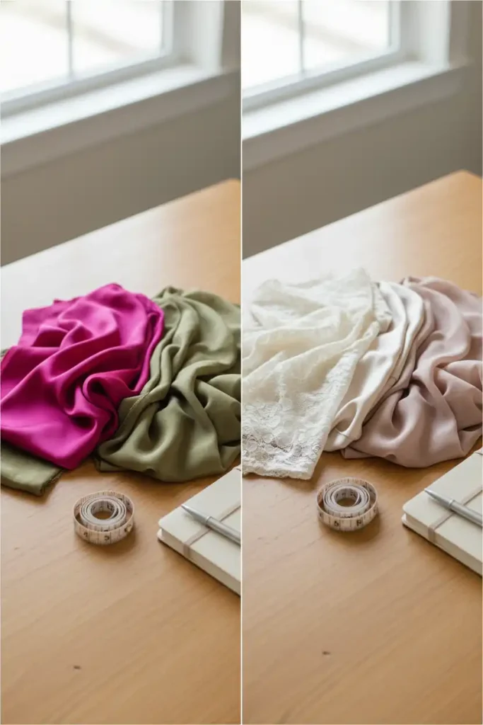
Even brides with a clear vision make color mistakes that only show up once photos come back, and by then it is too late to fix. The most common issue is picking colors from a screen without testing them in person. Order physical fabric swatches before finalizing any dress or linen color, and check them under your actual venue lighting.
Avoid choosing more than three main colors, since extra shades tend to compete rather than complement. Build your final palette from swatches you have touched and seen in person, not just images saved to a moodboard.
FAQs
What are the best fall wedding colors for 2027?
Terracotta paired with navy or blue, deep plum with sage, and warm neutrals layered with black accents are leading the season. These combinations feel current without losing that classic autumn warmth.
What colors go with terracotta for a fall wedding?
Terracotta pairs beautifully with navy, blue, burgundy, forest green, and brass or gold metallics. Stick to one or two complementary colors so your palette stays cohesive instead of busy.
Should bridesmaid dresses match exactly or just coordinate?
Coordinating works better than matching. Choose one color family and let each bridesmaid pick a silhouette that flatters her body, keeping the shade consistent across everyone.
What dress style works best for a rustic fall venue?
Soft, flowing fabrics like chiffon or crepe move naturally against wood beams and outdoor settings. Heavy structured satin can feel too formal for a barn or garden venue.